Small Spaces, Part II: Japanese Ideas for Small and Tiny Homes
This is the second of a series by architect and long-time Japan resident Azby Brown, the author of Small Spaces: Stylish Ideas for Making More of Less in the Home. In these excerpts from that seminal book, he offers some timeless advice on how to incorporate ideas used by Japanese architects in any kind of home, no matter how tiny.
By Azby BrownMaking Your Space Larger than It Seems
In Part II of this series, we look at two basic principles of good Japanese spatial design. One is changing the floor level, a useful and frequently seen method of separating interior space without using walls. But first we'll look at "living low." There is considerable speculation as to why the Japanese developed the habit of living on the floor; it is almost as if the entire house is one big piece of furniture, or one big bed. Today, most Japanese are equally comfortable seated on the floor or on chairs, although tables and chairs were popularized little over a century ago. Nonetheless, the practice of living low has a lot to recommend it, particularly where one is faced with limited space.
All photos by Yoshio Shiratori: drawings by the author.
Living Low: Increasing Perceived Room Size
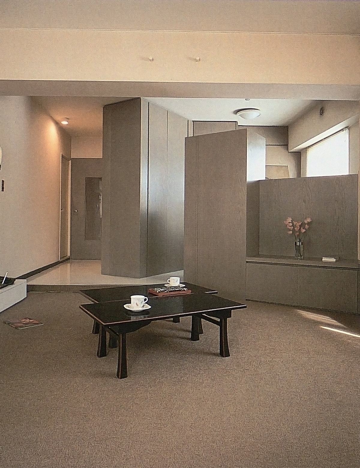
This view of a renovated one-bedroom apartment by Pittori Piccoli looks towards the kitchen and entryway.
In the photo above, note how, rather than separating the kitchen from the living area fully or leaving them entirely undivided, the designers have reached a comfortable compromise which admits light from the kitchen window into the living space, allows a place for the eye to wander outward and upward, and encourages conversation between the people in the kitchen and those in the living room. The right-hand part of the diagonal partition, integrated with the low seating/storage unit, is only shoulder-height; behind it is a kitchen counter. The rectangular volume connected to it houses the refrigerator and additional storage; it works with the floor-to-ceiling cabinet opposite to create a kind of miniature architectural skyline. The interiors and doors of the cabinets themselves are particularly well thought out. Notice the slight change in floor level and material between the two zones. Also, the round protrusions on the ceiling beam above can be used to mount translucent hanging room dividers for a little extra drama, color, and/or privacy.
Recent decades have seen an increase in experimentation with floor-level living in Western cultures; low sofas, beanbag chairs, and futons have become quite popular within certain lifestyles. The primary advantage to low living is a perceived increase in the size of the room, particularly the ceiling height. Also, the usual furnishings for a regular western room take up a lot of volume, they have legs or bases, backs, arms, and often reach or almost reach the ceiling. More often than not, they block the light, creating a zone or shadow from waist level down.
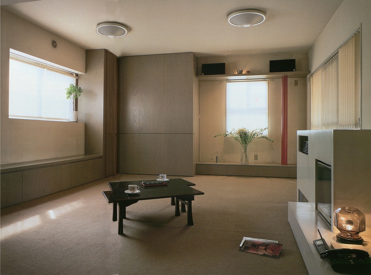
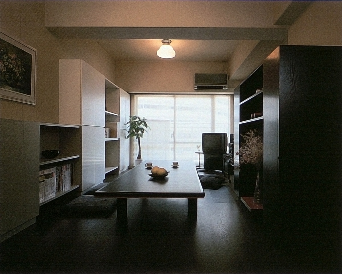
This view of the same room illustrates the most important principles of "living low." This room, 27 by 15 feet, is primarily used by the owners, a young couple, for living, dining, and entertaining. (By Pittori Piccoli)
In the room above, futons for sleeping are stored in the floor-to-ceiling cabinet against the far wall, next to which is the primary visual focus of the room, a modernized version of the traditional tokonoma: a low shelf with a decorative column and space for a flower arrangement and/or artwork. In this case, the "artwork" is the colored design on the window glass; the lower shelf itself houses audio equipment, and the cables for the speakers on the shelf above are concealed in the column. To the right can be seen a built-in cabinet housing the television and the heating/AC unit, plus a low counter with drawers. The left-hand wall has a long storage cabinet that doubles as seating as well as a back/elbow rest. The room can be enlivened with a variety of throw cushions and low tables.
Good western-based design uses these characteristics to create dramatic, dynamic living space. But, if you don’t have the space to begin with, you might be better off concentrating on the floor: cover it with something soft, keep it clean and uncluttered, and provide inviting corners, elbow rests, and visual foci. You'll find that very subtle changes of level, color, or texture will take on an enhanced dynamism. Counters and storage elements can be kept lower, exposing more bare wall. This—also because the floor covering itself can be a more reflective, lighter color—means that less lighting, artificial as well as natural, can have a greater effect. Above all, most people feel more relaxed and less formal stretched out on the floor or sitting cross-legged in a circle of friends. Assuming one suffers neither from excess dignity nor stiff legs, the spatial payoff can be quite large.
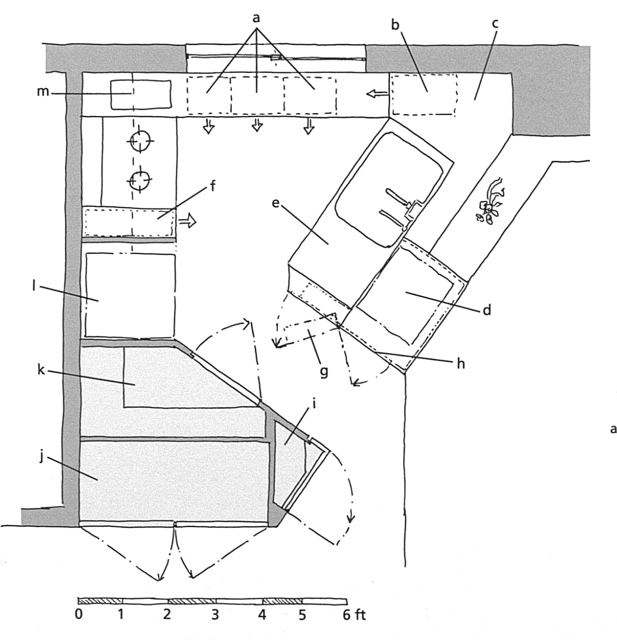
The kitchen of the same one-bedroom apartment.
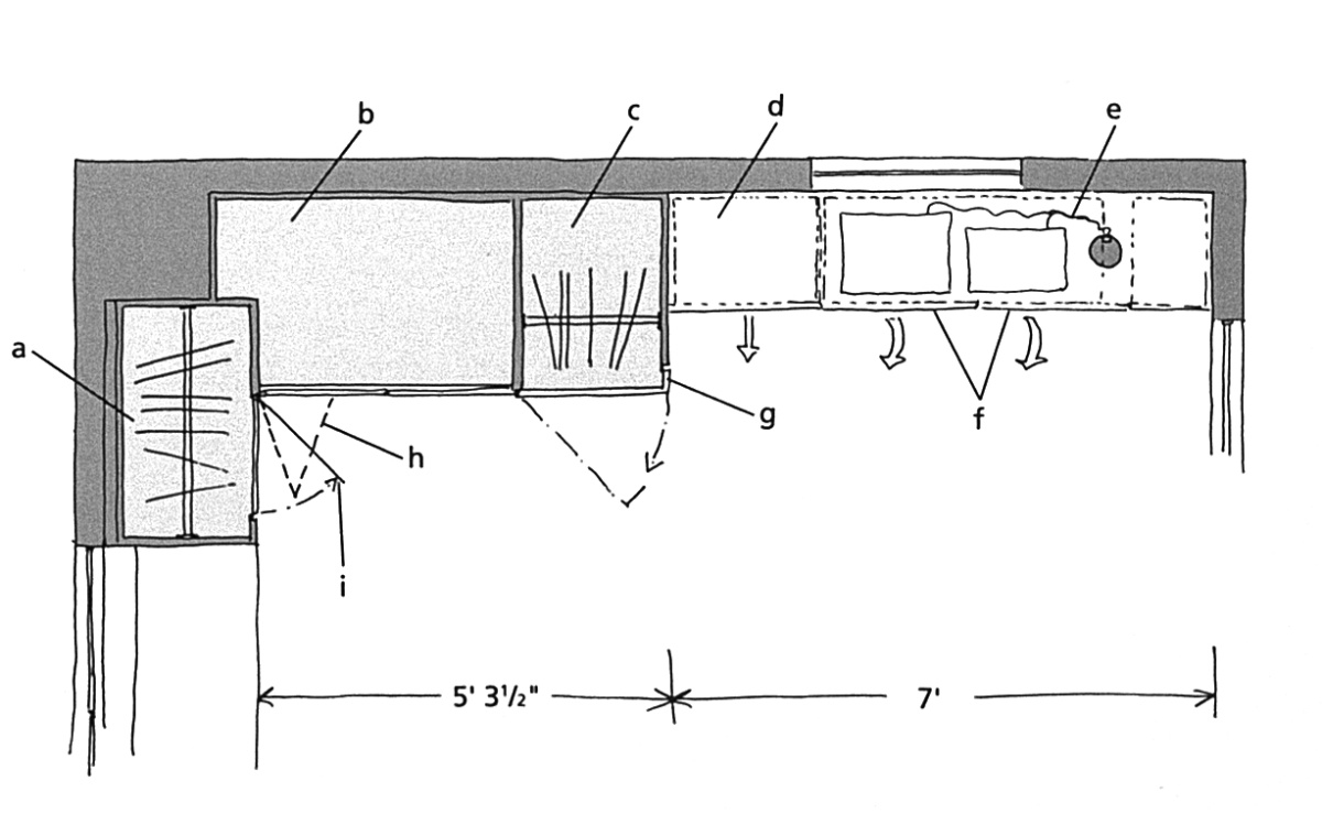
This is the plan of the compact kitchen behind the divider: a) countertop with three shallow drawers, cabinets below, b) three drawers stacked vertically, c) eye-level counter, d) microwave enclosed at eye-level, e) waist-level counter, cabinets below, f) tall, skinny drawer slides out, g) door-mounted spice rack, h) access to storage under microwave, i) storage for cups, etc., with L-shaped door; shelf corners beveled for safety, j) linen cabinet, k) pantry, l) refrigerator, m) line of cabinets above.
The closet and audio cabinet details.
a) full-length hanging storage, b) bedding storage shelves, c) hanging storage, one rod above, one below, d) sliding drawers with storage, e) speaker cable runs up column to shelf above, f) front panels fold down for stereo access, g) L-shaped door, h) double-hinged folding door, i) simple door.
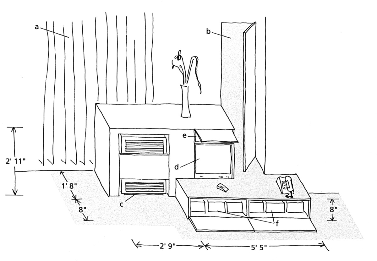
Television and heater cabinet details.
a) window for light behind, b) deep, narrow storage, c) heater/AC unit, d) TV, e) AV equipment, f) storage.
Level Change: Effective, Efficient Use of Space
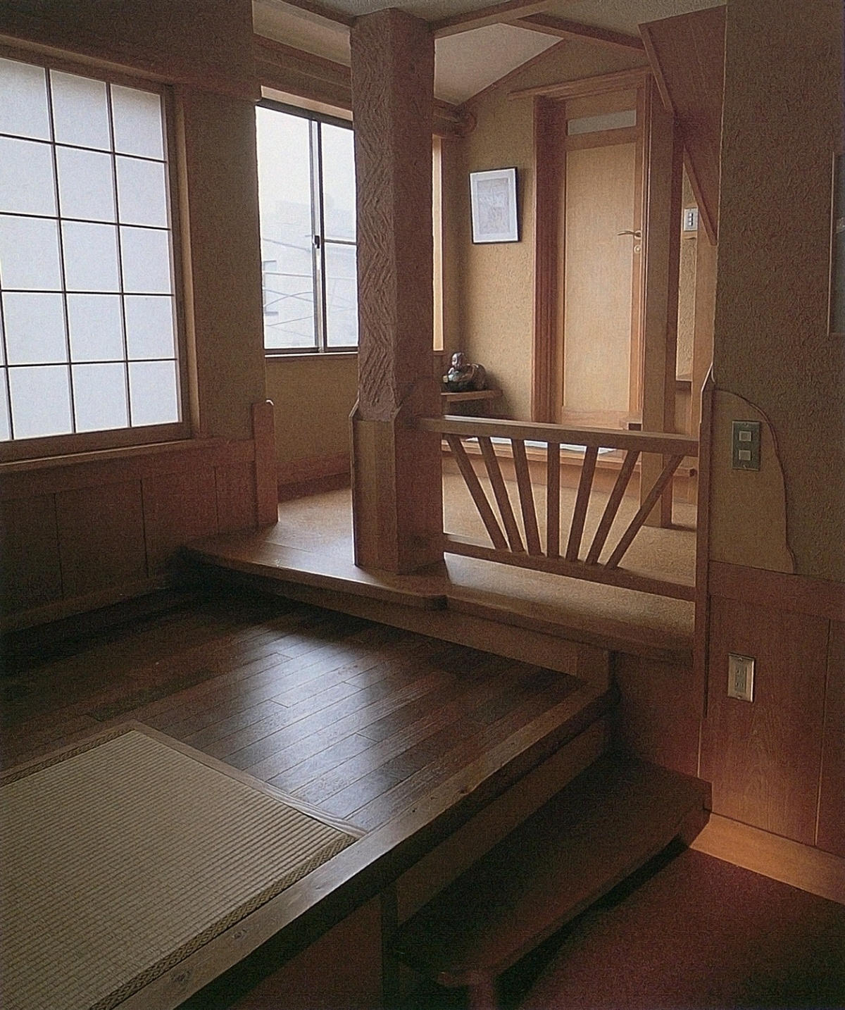
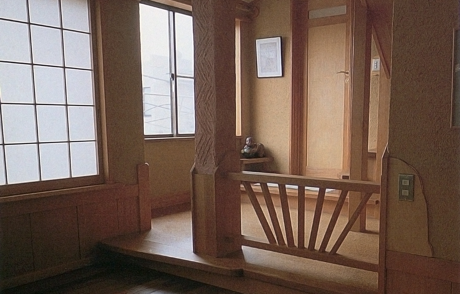
A detailed view of a Tokyo apartment by Atelier Mobile (a wider shot can be seen in Part I of this series).
Four different floor levels are used in this small area, adeptly demonstrating the advantages of the level-change technique. The floor surface also varies throughout this house in keeping with the use of each space, from stone in the entry, to dark natural wood, to tatami, to cork flooring, to bathroom tile. Columns and a wooden railing enhance the soft division of the space.
One of the most useful and hence most frequently seen methods of separating interior space without the use of walls is to set it off by means of a change in floor level. A level change of only a few inches, perhaps accompanied by a change in floor covering, can easily differentiate a space intended for relaxing, sitting, or talking, from one used for standing, movement, or storage. A section of the floor can even be raised high enough to allow significant storage underneath. Similarly, a change in ceiling height can be effective in defining a small area for a specific use; if the change is great enough, the space above can be freed for other uses, ranging from book storage to a sleeping loft. Floor and/or ceiling height changes may be accompanied by vertical partitioning of some sort—curtains, shelving, or sliding panels, for instance, depending upon the circumstances.
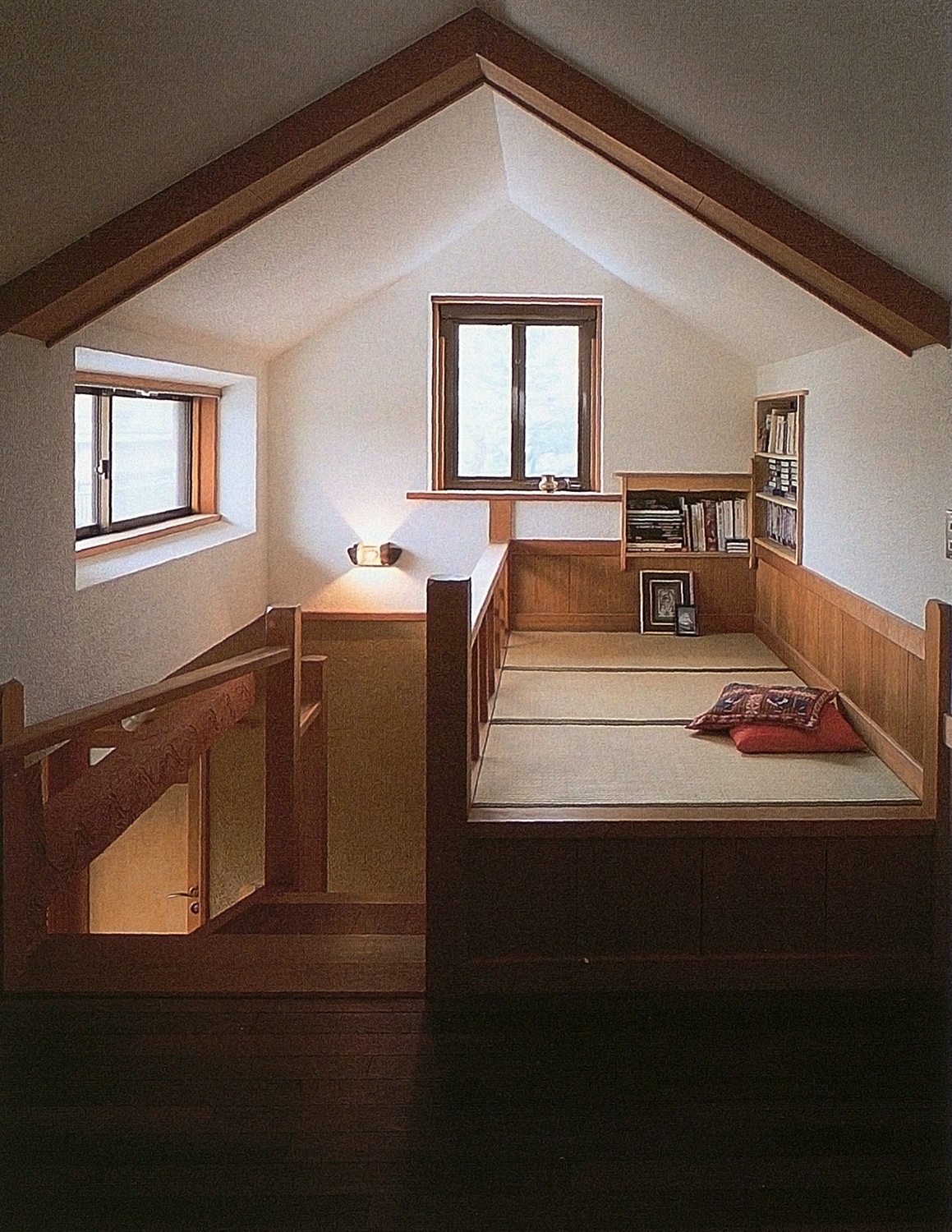
At the top of the stairs in the same apartment.
As can be seen in this shot of the same apartment, the second-floor loft—intended as a child's room or work space—further utilizes level changes. Here, a small tatami-matted nook for sleeping or relaxing is set above the rest of the floor. (By Atelier Mobile)
Of course, the effect of a change in level can be magnified by an accompanying modification of light, material, color, or texture. The addition of accenting elements such as shelves, moldings, niches, or even a picture on the wall, can help visually integrate the raised level. The eye usually seeks out light sources and strives to recognize individual contrasting elements in the brief split-second before it gauges floor heights, wall angles, ceilings, and so on, probably a hold-over from the time when an instant instinctual understanding of unfamiliar surrounding was a matter of survival. So, making a level seem more like the location of a desirable goal—sunlight on a wooden sculpture, inviting pillows, a bowl of tropical fruit—will allow the actual floor height change to be perceived as prologue to a consummation, not as an intrusion. After all, no one wants to stumble over a threshold for no reason.
Finally, level changes may be required for practical reasons—to accommodate a garage below, to house the plumbing for a retrofit bathroom, or simply because the floor needs a new surface. In such cases, the need becomes an opportunity, but one which may require compromises. On the other hand, one may want levels just for fun. No problem there: just imagine yourself floating around the room, magic-carpet-style, and pick an attractive spot to settle several inches off the floor.
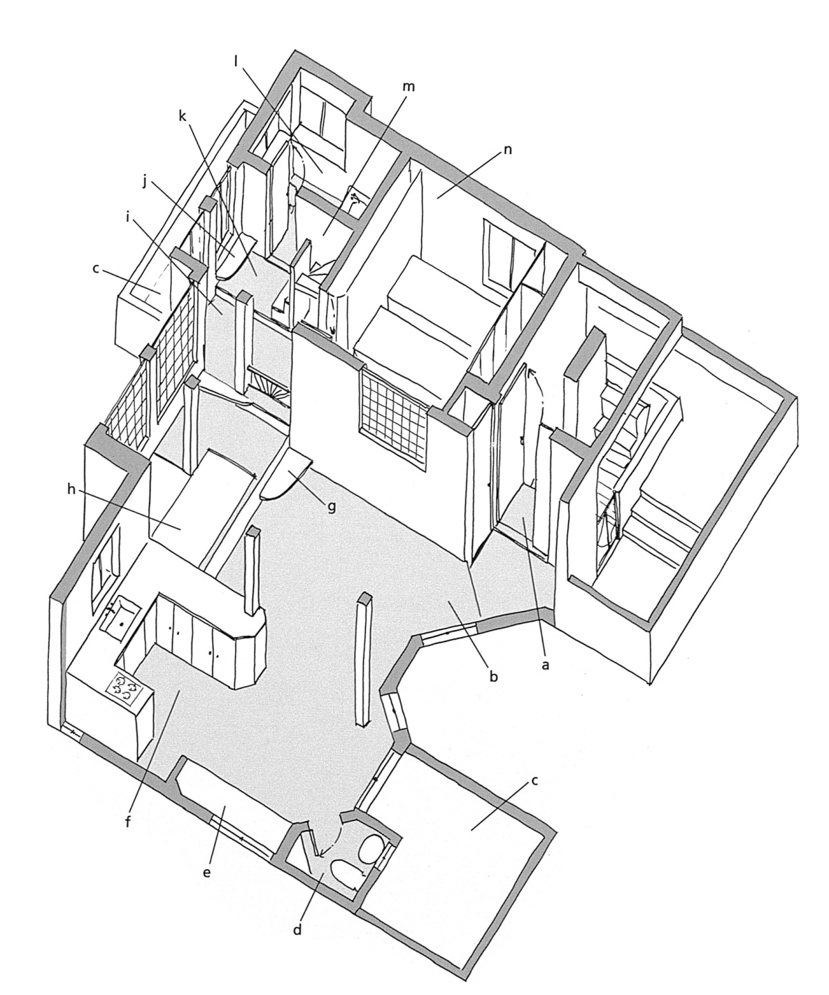
First floor layout of the multilevel apartment in the photos above.
a) entrance (level 1), b) living area (level 2), c) outdoor terraces (there are three), d) toilet/lavatory, e) built-in seating nook for dining, f) dining area (level 2), g) step, h) tatami-floored seating nook (level 3), i) bedroom landing (level 4), i) display shelf, k) stair landing (level 5),1) main bathroom (level 6), m) stairway, n) master bedroom.
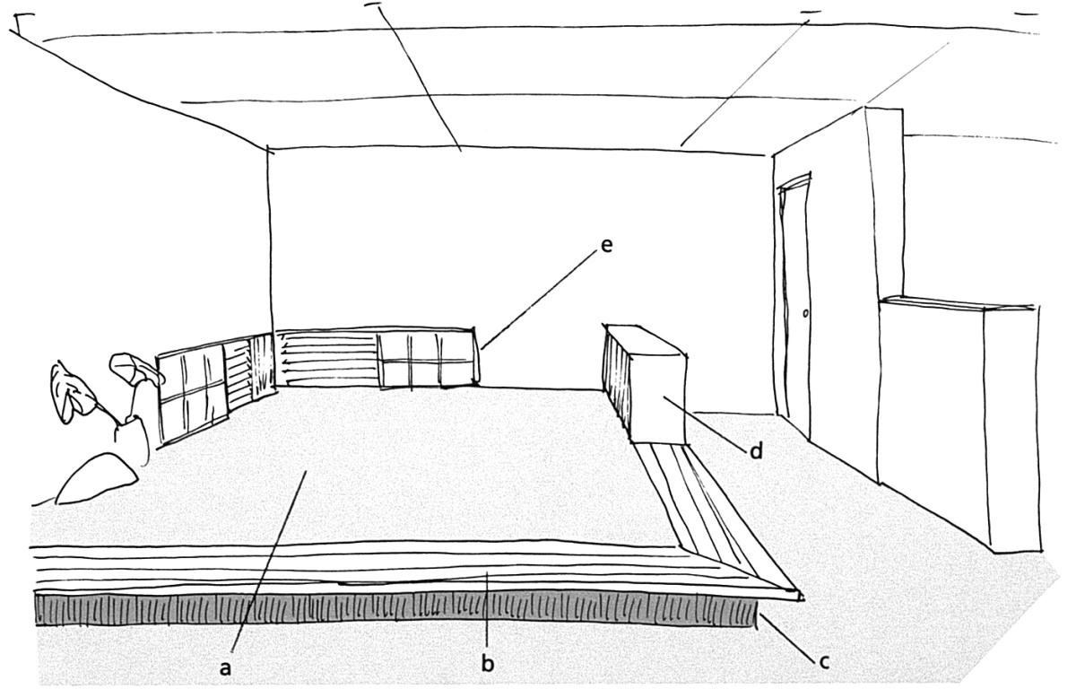
A special nook made simply but effectively by means of a small change in floor level and low windows
a) carpeted floor, b) wood surface, c) eight-inch rise, d) cabinet, e) low windows with translucent shutters.
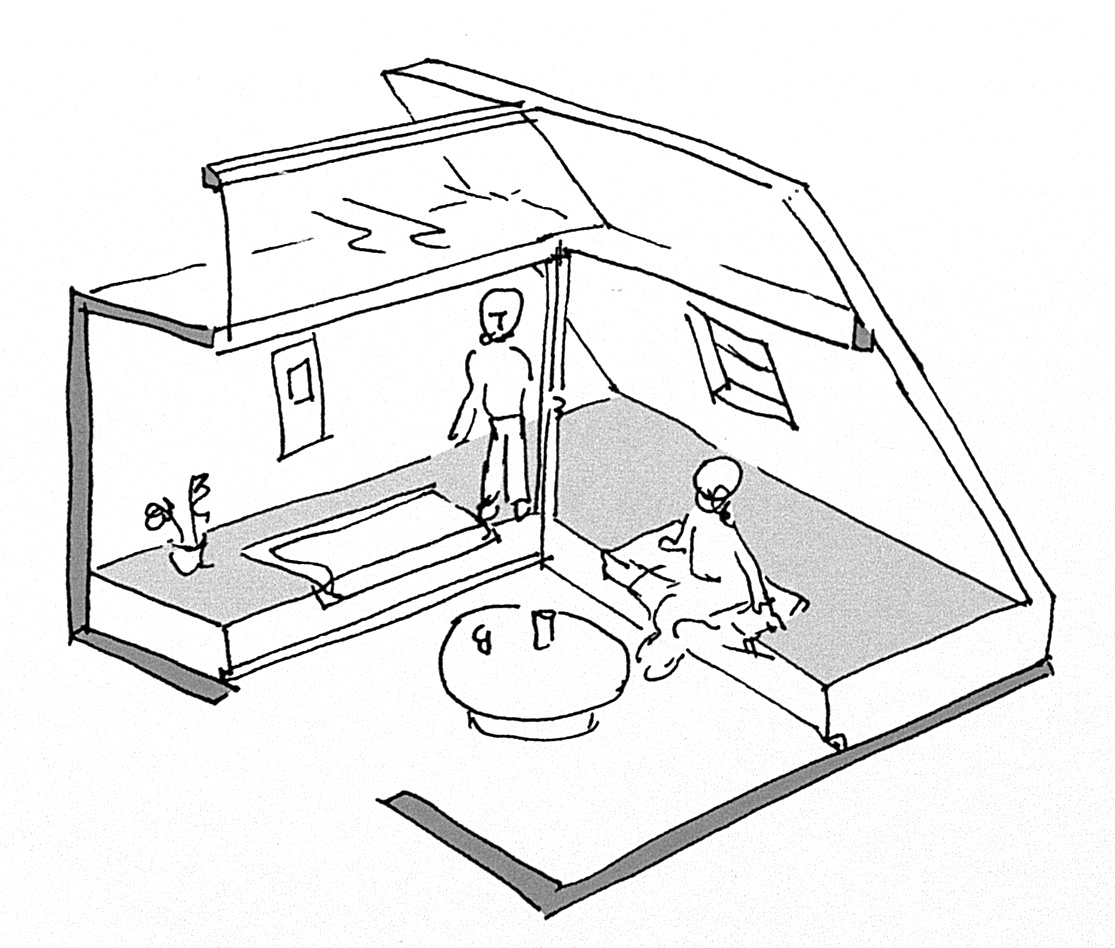
Use of level change to form low seating, creating comfortable, well-lit nooks.
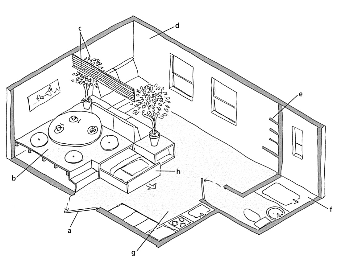
Sample room layout that takes advantage of levels and other “soft division" techniques.
a) entrance, b) raised dining area with fixed table (space below can be adapted for storage), c) living/dining areas divided by grille above, plants and seat backs below, d) living area, e) line of shelves, f) bathroom, g) kitchen area, h) bed pulls out for use.
Articles in this series cover more practical examples of ways Japanese architects have used these concepts in interesting and innovative ways. Some of the features covered include:
Part I: Horizontality, Lighting and Color Patterns
To come:
Bringing the Exterior into the Interior to Broaden Horizons
Wise Use of Space: Under stairs, floors, etc.
Clever Storage Ideas
Make the Most of Your Kitchen Space
About the book, "Small Spaces: Stylish Ideas for Making More of Less in the Home"
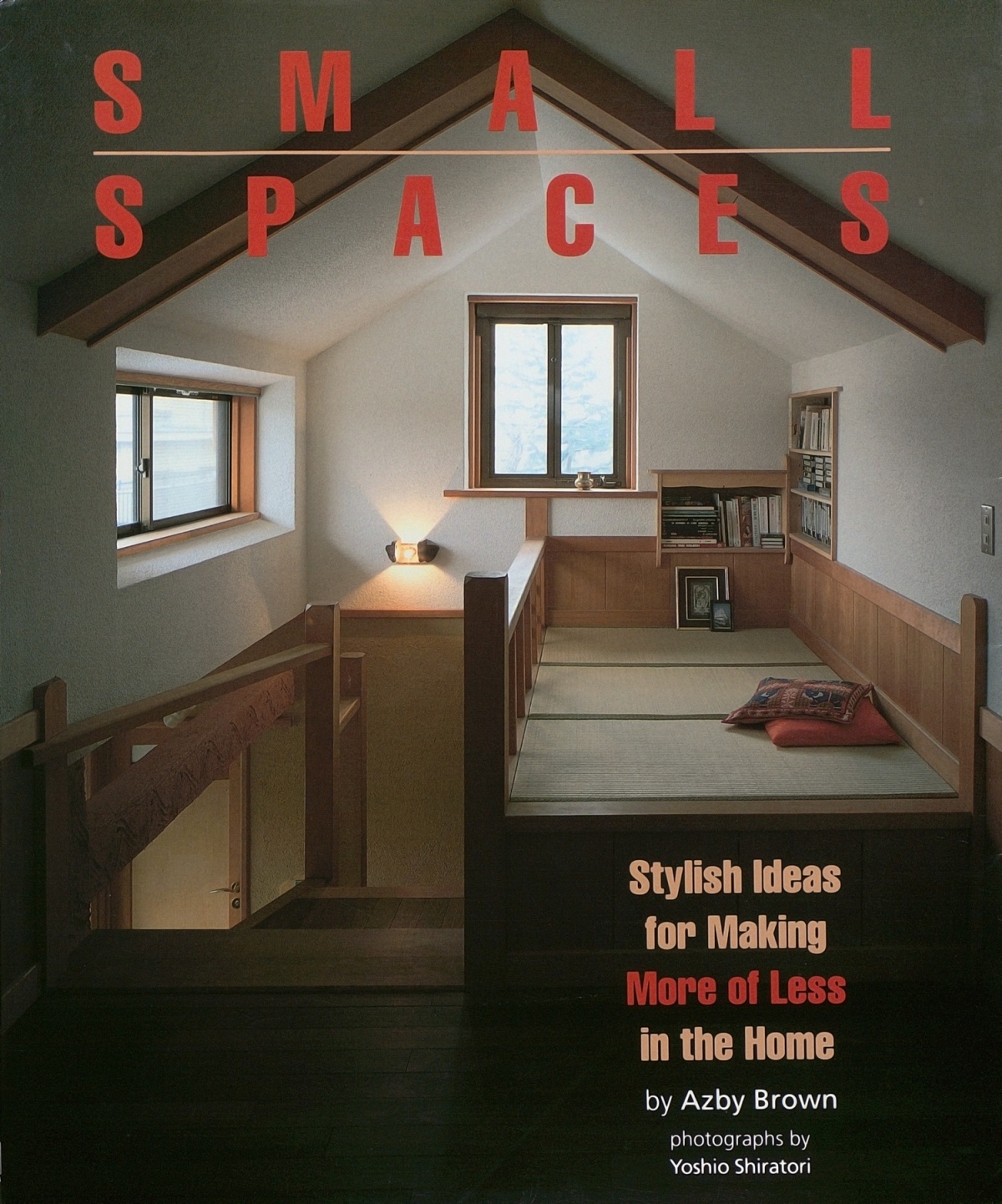
Small Spaces was released 30 years ago. In the years prior to this, a number of English-language books dealing with the design of both contemporary and historical Japanese houses had become available, and several became invaluable sources for specialists and academic readers. For the general audience, some provided advice on how to integrate shoji, tatami, and other Japanese features into Western lifestyles. Small Spaces was different from all of these. That Japanese homes were by necessity more compact than their Western counterparts was noted from time to time in writing about Japanese architecture aimed at the West. But this was almost invariably considered a “quirk” derived from a unique cultural and economic context, often amusing, sometimes clever.
Small Spaces, on the other hand, made the case that many people in other countries already needed the kind of compact living space ideas that had become common in Japan, and that in coming decades the need would only increase. This was clearly prescient. Back in the early 90’s, the Japanese architectural and lifestyle press was awash in the kinds of hints and space-maximization techniques that found their way into Small Spaces. I sensed that a convergence was occurring, and that people abroad were ready to live more like the Japanese. The book highlighted how people actually lived, focusing less on the work of starchitects and more on designers who worked to solve problems for average households.
The book’s approach was part technical, part perceptual, and part philosophical, and stressed how many seemingly new design ideas are rooted in Japanese tradition. This was, of course, decades before Mari Kondo. More significantly, what has become known as the “Tiny House Movement” was beginning to emerge. Small Spaces was frequently cited as a pioneering design sourcebook for compact design, by Stewart Brand, for instance, in How Buildings Learn of 1994, and in The Not So Big House by Sarah Susanka in 1997.
My later book, The Very Small Home, released in 2005, garnered even more international attention, undoubtedly thanks to exposure on the internet, which had emerged in the interim. Small Spaces thankfully remains in print after 30 years. Some of the designs presented in the book have aged better than others, but the underlying principles remain vitally important.
Amazon US
Amazon Japan
Amazon UK


