Small Spaces, Part 1: Japanese Ideas for Small and Tiny Homes
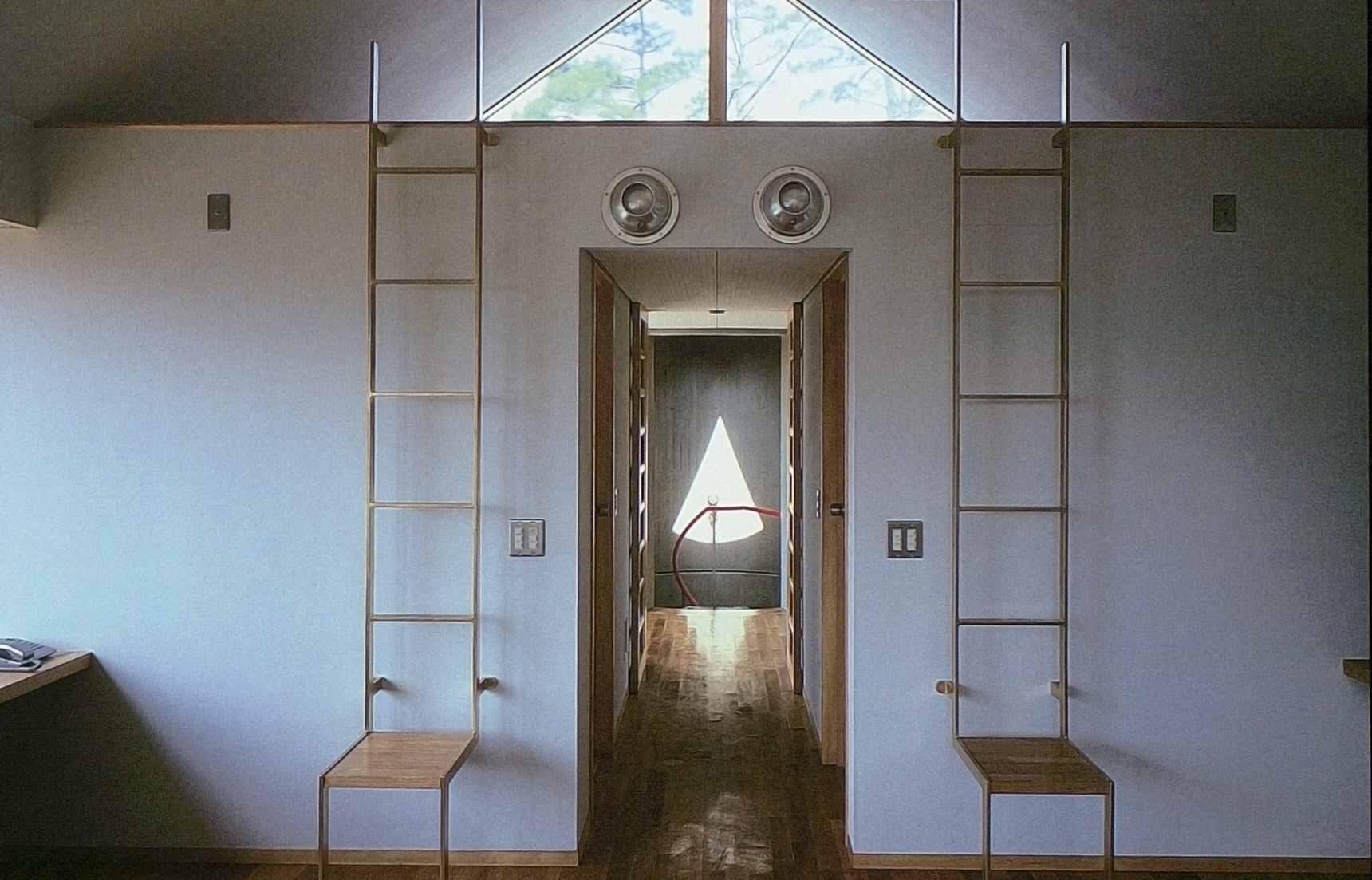
Architect and long-time Japan resident Azby Brown is the author of Small Spaces: Stylish Ideas for Making More of Less in the Home. In these excerpts from that seminal book, he offers some timeless advice on how to incorporate ideas used by Japanese architects in any kind of home, no matter how tiny. (Top: Design by Time Architects)
By Azby BrownCompact, Comfortable, Convenient
In Part 1 of this series, we look at useful concepts that underlie space-efficient Japanese home design. These are not intended to give your home a “Japanese” style, though many of the concepts are rooted in tradition. Instead, these concepts are meant to stimulate your thinking about how to make the most of your own living space.
Apart from the fact that the Japanese have always taken small spaces (and small things) seriously, there has always been a tendency to value the compact and flexible over the massive and immovable. More specifically, over the centuries there has been a continual emphasis on lowness and horizontality, a dynamic interrelationship between living spaces and storage zones, extensive use of modular, rearrangeable cabinetry, and a particular attention to the nuances of lighting, color, and pattern.
All photos by Yoshio Shiratori; drawings by the author
Horizontality: Making Small Spaces Feel Larger
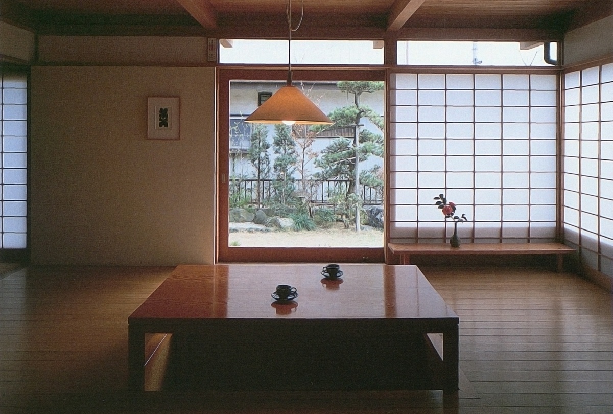
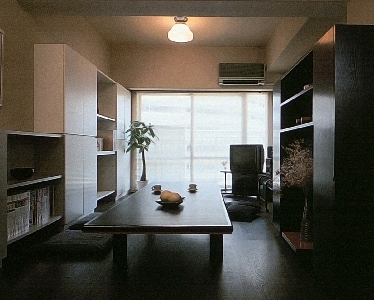
This house in Narashino, near Tokyo, might be called a "modern traditional" Japanese home. While maintaining a number of older characteristics—such as the shoji screens and the low table, it has the freshness and convenience associated with modern comfort
In the photo above note the quality of the light, the windows, and the dominant horizontal lines, all of which make the room feel wider and more open. The tabletop can be set flush to the floor when not in use, and has a heating element underneath to warm the feet during winter months. (Design by Shoroku Tsukuda)
Traditional Japanese interiors utilize low tables and floor-level seating. The greatest single advantage of this low, horizontal orientation in living space is that smaller spaces feel larger. The psychological and perceptual reasons for this are still poorly understood, but there seems to be a ratio between perceived horizontal expanse and perceived vertical limit that determines whether one feels confined or unconstricted.

Horizontality and the role of the floor: a) large area of shadow under table and chairs, b) less shadow under low table, c) figure seated on floor can be given privacy by waist-height screen which doesn't block much light.
Of course, a lot depends upon the surrounding surfaces, their color and material, the light, and other elements which attract one's attention. But basically, when one is seated on the floor, the ceiling is farther away than if one were seated on a chair or standing, and the field of vision naturally adjusts itself to be more sensitive of features which lie within the horizontal space defined by one’s body. Small horizontal changes of level have greater impact, and less is required to bound the space. Of course, to live low to the floor one needs to have less on it, and everything should be smaller and easily movable; this enhances the feeling of emptiness, and can mentally enlarge even a small room.
Lighting and Color Patterns: Creating Depth Illusions
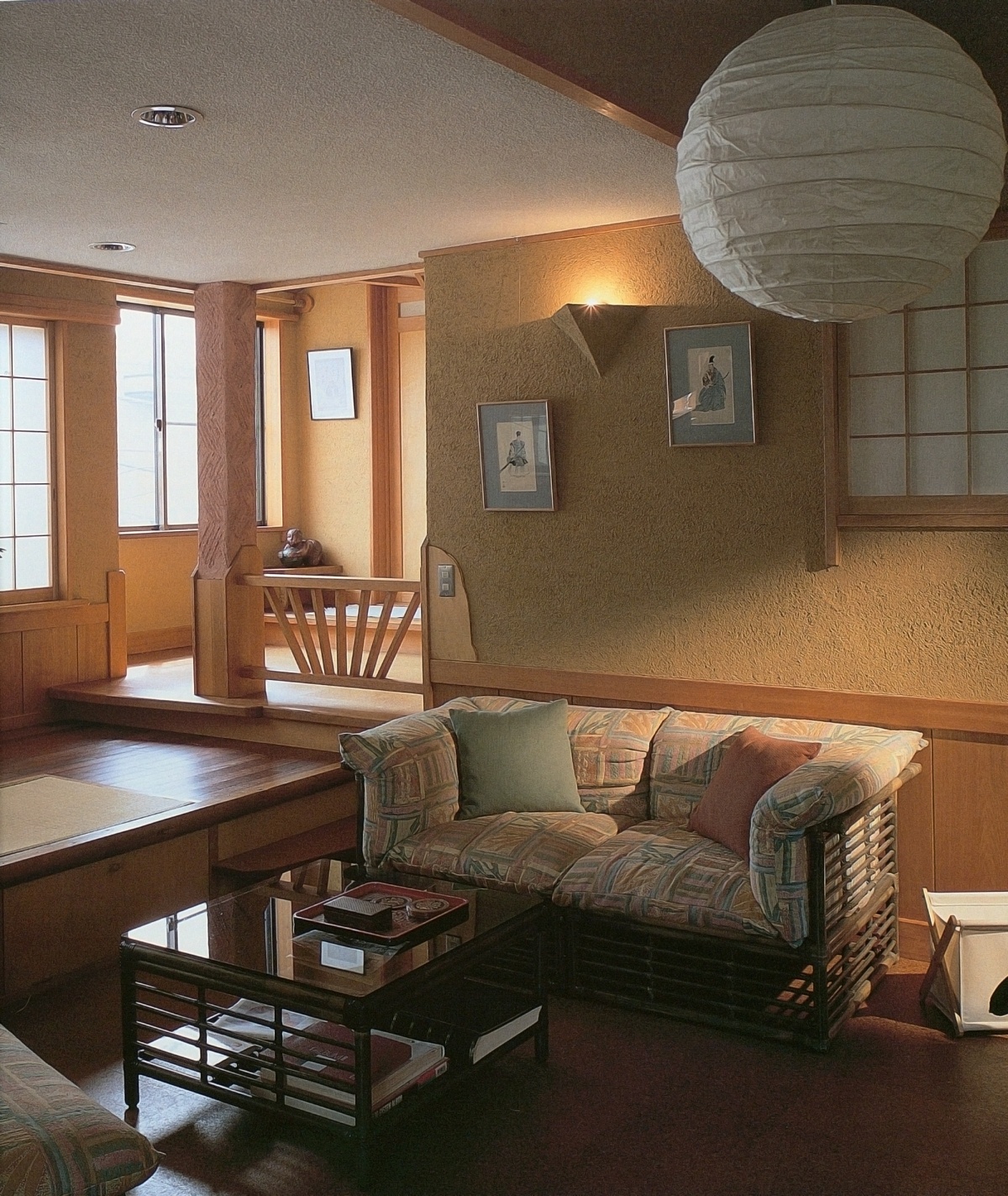
This Tokyo apartment demonstrates the use of levels in a spectacular way. The 710-square-foot first floor is divided into six levels, plus a small display shelf at the farthermost corner. Stairs lead to a 228-square-foot loft above. (by Atelier Mobile)
In the home above, the entrance is on the lowest level, with living dining, and kitchen on the second. A tatami-floored seating nook is on the third. The fourth is the master bedroom and the fifth is a stairway. The bathroom occupies the sixth level. Columns are well-placed to enhance the soft division of space, all in a brilliant and attractive design.
In traditional Japanese rooms, direct light is avoided in favor of indirect, filtered, or reflected light. The main practical reason for this is that a shady interior is cooler than one which receives sun directly. Filters such as translucent screens, wooden grilles, and hanging blinds help create the illusion of great spatial depth, especially when used cleverly in an overlapping manner. Allowing the interior to be partially illuminated by reflections from a light-colored ground or water surface outdoors can provide the pleasant illusion of an insubstantial ceiling and upper wall.

Different types of indirect light: a) sunlight reflects off ground, b) hanging sudare blinds, c) transom grille, d) shoji, e) movable folding screen
Color, too, can be used to enhance or shape the living space. Light colors are better than dark ones for walls, but the ceiling should be a few shades darker than the walls. This way, the walls won’t attract as much attention, particularly if they are an even, restful natural tone, while the ceiling will seem to recede. Both the color of the room and the patterns created by their elements can be tuned to lead the eye to points where the room opens up, and to enhance the illusion of size, depth, and openness. Vertical lines should be used with great care as dark accents on a light ground, and should never be allowed to overpower the horizontal lines.
Taking Small Space Seriously: The Nuance of Details
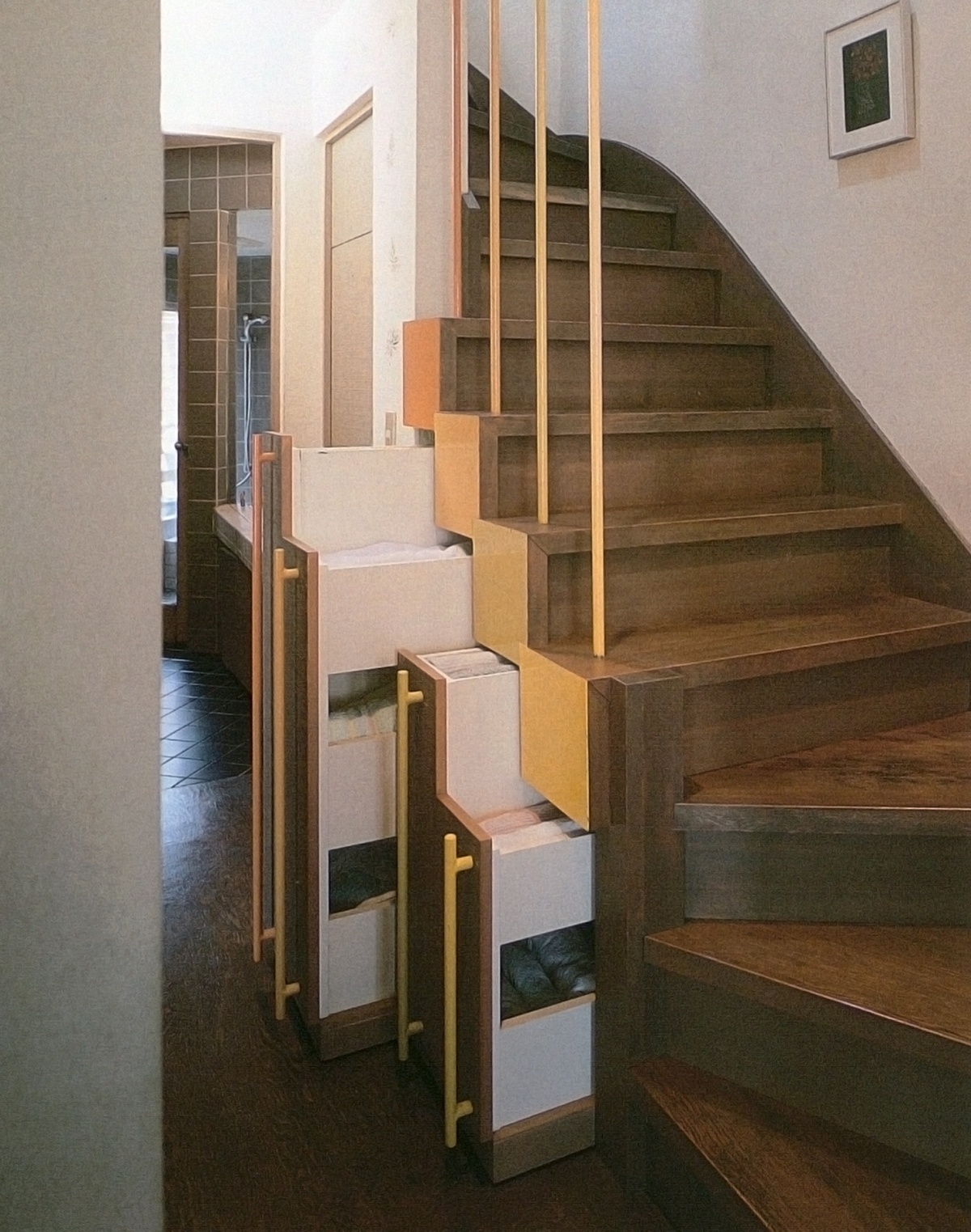
These stairs are used to reach the children's bedrooms on the second floor, and are near the bathroom and laundry. The architect provided fully removable rolling cabinets, where they are easily accessible. (Design by Pittori Piccoli)
Partly due to necessity and partly due to religious and ethical ideals, the Japanese long ago developed what can be called “an aesthetic of the intimate.” Japanese culture takes small things seriously, and small spaces are no exception. In the best cases, it is as if the artist—be it a carver of miniatures, a lacquerware craftsman, a potter, carpenter, or a painter of nature scenes—intends to entice viewers into developing their own powers of observation. Entire worlds are “conjured up” by the nuance of details.

Teahouse (chashitsu): tatami mat area about 2 x 2 meters. a) nijiriguchi low entrance, b) tokonoma alcove, c) tokobashira decorative alcove pillar, d) low window with sliding screen, e) hearth, f) brazier for heating water.
The natural world, of course, is both the starting and end point, and the traditional artist generally believed it could best be captured on a small scale. This explains, in part, the impetus behind the creation of the first teahouses (chashitsu). Often no more than six feet square, and even less in some notable examples, the chashitsu was conceived as a place where one could focus one's attention on the intimate world.
One of the paradoxes inherent in the teahouse is that when the setting and company are just right, one ceases to be aware of space at all. In plain terms, sometimes all one needs to be truly content is a perfect corner, a good book, and a cup of tea. If you think about designing your home as discovering what your “perfect corner” needs, then you will be well on the way to learning to appreciate a small space—precisely because of its smallness.
Compact and Flexible: Fitting Your Lifestyle
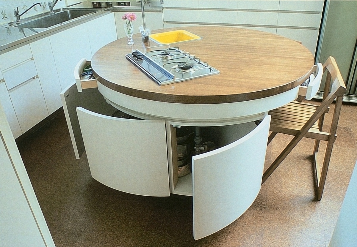
This 1.3-meter-diameter kitchen island has room for a sink, a double gas burner, three drawers and amble below-counter storage—and can accommodate two persons seated comfortably. (Design by Pittori Piccoli)
Compactness and flexibility have been characteristic of the best Japanese design since ancient times. Poverty and lack of space may have been the original impetus, but over time, these seem to have become a primary source of pleasure in Japanese design—witness Transformer toys, and collapsible motorcycles.
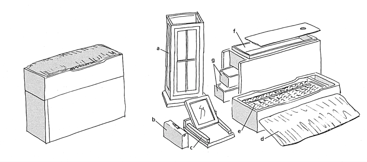
Compact and flexible traveler's pillow box from Edo-period—an early example of a compact, multipurpose device: a) floor lamp, b) sewing kit, c) mirror and stand, d) cushion, e) abacus, f & g) storage drawers.
Although Japanese today consume a lot and discard more, most still prefer some items that embody older virtues. While optimum performance and durability is often sacrificed for size and flexibility, this is the sort of necessary trade-off that all of us with limited space are faced with. But it should be remembered that in the home, the “performance” of a design element should not be gauged by industrial standards or the whims of fashion but by how well it fits one's lifestyle. The goal is to reinforce your personality through customization, not camouflage it through conformity. Where this is the concern, any tool that works should be used.
The Series: Small Spaces
Articles in this series will cover more practical examples of ways Japanese architects have used these concepts in interesting and innovative ways. Some of the features covered include:
How Living Low and Changes in Levels Increases Perception of Space
Bringing the Exterior into the Interior to Broaden Horizons
Wise Use of Space: Under stairs, floors, etc.
Clever Storage Ideas
Make the Most of Your Kitchen Space
About the book, "Small Spaces: Stylish Ideas for Making More of Less in the Home"
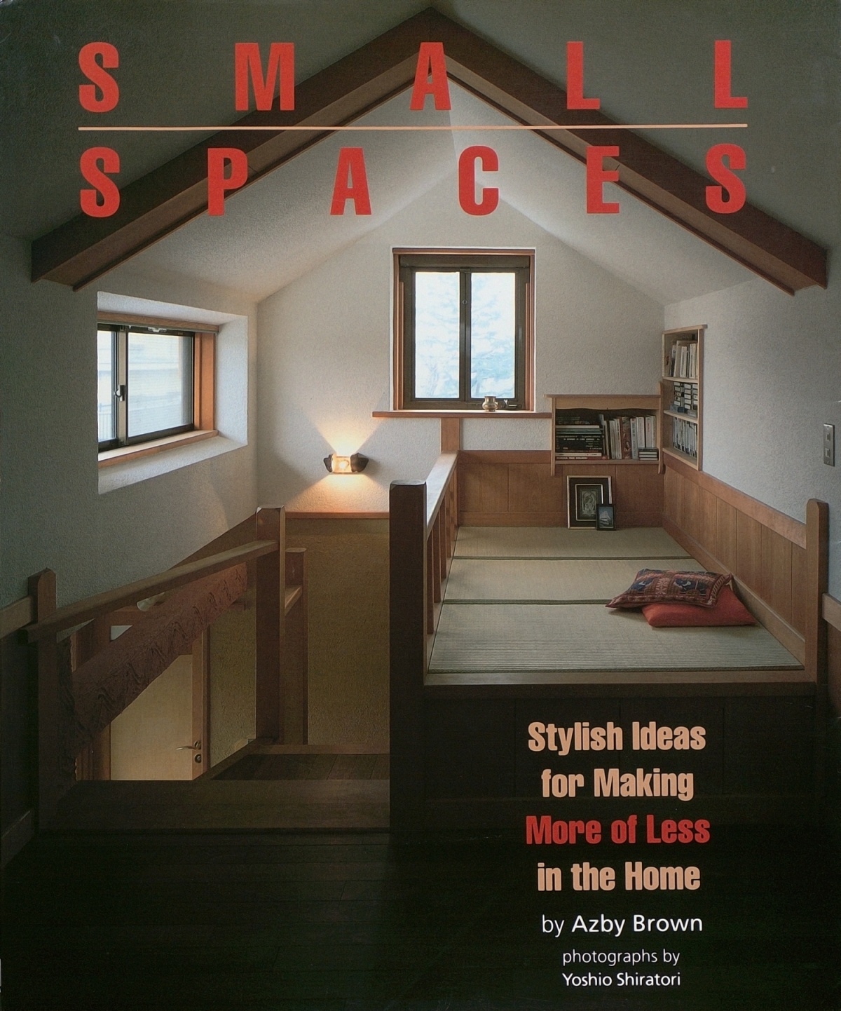
Small Spaces was released 30 years ago. In the years prior to this, a number of English-language books dealing with the design of both contemporary and historical Japanese houses had become available, and several became invaluable sources for specialists and academic readers. For the general audience, some provided advice on how to integrate shoji, tatami, and other Japanese features into Western lifestyles. Small Spaces was different from all of these. That Japanese homes were by necessity more compact than their Western counterparts was noted from time to time in writing about Japanese architecture aimed at the West. But this was almost invariably considered a “quirk” derived from a unique cultural and economic context, often amusing, sometimes clever.
Small Spaces, on the other hand, made the case that many people in other countries already needed the kind of compact living space ideas that had become common in Japan, and that in coming decades the need would only increase. This was clearly prescient. Back in the early 90’s, the Japanese architectural and lifestyle press was awash in the kinds of hints and space-maximization techniques that found their way into Small Spaces. I sensed that a convergence was occurring, and that people abroad were ready to live more like the Japanese. The book highlighted how people actually lived, focusing less on the work of starchitects and more on designers who worked to solve problems for average households.
The book’s approach was part technical, part perceptual, and part philosophical, and stressed how many seemingly new design ideas are rooted in Japanese tradition. This was, of course, decades before Mari Kondo. More significantly, what has become known as the “Tiny House Movement” was beginning to emerge. Small Spaces was frequently cited as a pioneering design sourcebook for compact design, by Stewart Brand, for instance, in How Buildings Learn of 1994, and in The Not So Big House by Sarah Susanka in 1997.
My later book, The Very Small Home, released in 2005, garnered even more international attention, undoubtedly thanks to exposure on the internet, which had emerged in the interim. Small Spaces thankfully remains in print after 30 years. Some of the designs presented in the book have aged better than others, but the underlying principles remain vitally important.
Amazon US
Amazon Japan
Amazon UK


